Custom Styling
How to style Awtomic to match your theme or brand design
Everything visible to your customers on your online store that you install from attempts to pick up elements of your theme styles automatically, though many online stores use themes that are highly customized and as a result styles and layouts require extra effort to match. If you wish to have a different styles, you can change these styles as you see fit using CSS, or reach out to us for support ([email protected]).
Please note that any time you switch themes, all snippets (Account management, orders and cart) will have to be installed again and re-styled if you’ve done custom styling.
Though all elements that are added to your shop (like the Awtomic subscription plan selector) by the app attempt to take on theme styling, you can override these styles in your own css.liquid file that you import into the proper sections or templates. Ideally you should create your own new asset file for custom CSS and import it yourself. For class names, you can inspect any element that is added by on your site and override the class name with your own custom styling.
The plan selector is hidden until you click “Make Public” on the Awtomic App’s Setup Guide under Help but if you’d like to preview the plan selector on your shop before you launch, you can use the Awtomic Preview Mode.
If you want to show buttons instead of a drop down selector for your subscription plans, reach out to [email protected] - we do support this functionality but it is not a setting in the app yet.
How to Add Custom Styles:
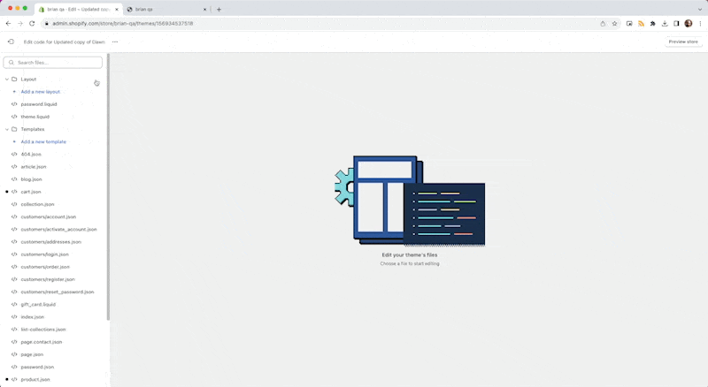
- Head over to your Shopify dashboard.
- Make your way to
Online Store>Themes. - Tap on
Actions>Edit Code. - Track down and select your theme's main CSS/SCSS file. This might bear a name like
styles.scss.liquidor similar. - At the tail end of this file, sprinkle in your custom styles.
Point of Caution:Steer clear of classnames like
"Typography__Span-sc-1enup42-1"and"uJwtZ". These will change without notice. Only use classnames in plain english that seem similar to the list in this document.
As a quick illustration, to jazz up the background color of the button--primary, you could pop in:
.button--primary {
    background-color: #FF5733; /* Or swap with your favorite shade */
}
Classnames to Customize:
Below is a curated list of classnames ripe for customization. Keep in mind, certain classnames might seem eerily alike, but they each hone in on unique elements. Precision is key!
.awt-filter-button,
.awt-filters-container,
.awtomatic-progress-container,
.awtomatic-progress-count-label,
.awtomatic-progress-item--pending,
.awtomatic-progress-item,
.awtomatic-progress-product-count-container,
.bundle-button,
.bundle-close-icon--modal-close,
.bundle-close-icon,
.bundle-container,
.bundle-create-content,
.bundle-hide-sm,
.bundle-lazy-image-container,
.bundle-product-card__price,
.bundle-product-card__quantity-button-container--button,
.bundle-product-card__quantity-button-container,
.bundle-product-card__title,
.bundle-product-card,
.bundle-scrollable-section,
.bundle-section__nav,
.bundle-section__title,
.bundle-section-container,
.bundle-section,
.bundle-step-label,
.bundle-stepper-counter--complete,
.bundle-stepper-counter--incomplete,
.bundle-stepper-header,
.bundle-stepper-item--complete,
.bundle-stepper-item--incomplete,
.bundle-stepper-wrapper,
.bundle-text--body,
.bundle-text--display,
.bundle-text--emphasis,
.bundleapp-modal__backdrop,
.bundleapp-modal__container--complete-screen--header-container,
.bundleapp-modal__container--complete-screen,
.bundleapp-modal__logo,
.bundleapp-modal,
.button--primary,
.button--secondary,
.is-scrolling-up,
.p_8068229660990, (and similar product id classnames)
.pv_44297820045630, (and similar product variant id classnames)
.q_0, (and similar quantity classnames)
Alongside classnames, remember you can also harness IDs for pinpoint styling. Simply prefix with # when styling, e.g., #myCustomID.
Point of Caution:Steer clear of classnames like
"Typography__Span-sc-1enup42-1"and"uJwtZ". These will change without notice. Only use classnames in plain english that seem similar to the list in this document.
If you're hankering for some inspiration or feel a tad shaky about CSS, our support team is always on standby to assist.
Here's a quick screen grab of how to add styles to your existing theme styles:
Updated 11 months ago