Advanced Build-a-box Progress Bar
How to add custom CSS to show the advanced progress bar on your Awtomic build-a-box pages.
The custom progress bar is only available on boxes that use fixed box sizes
Some boxes use minimums/maximums and they will not have a progress bar that can be customized.
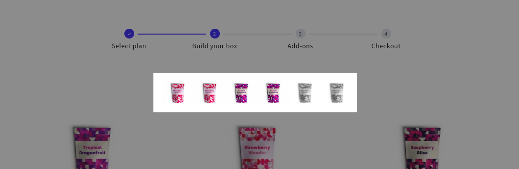
The default progress bar can be updated with some custom CSS to render the advanced progress bar that shows selected items and allows your customer to remove items from their box.
Steps:
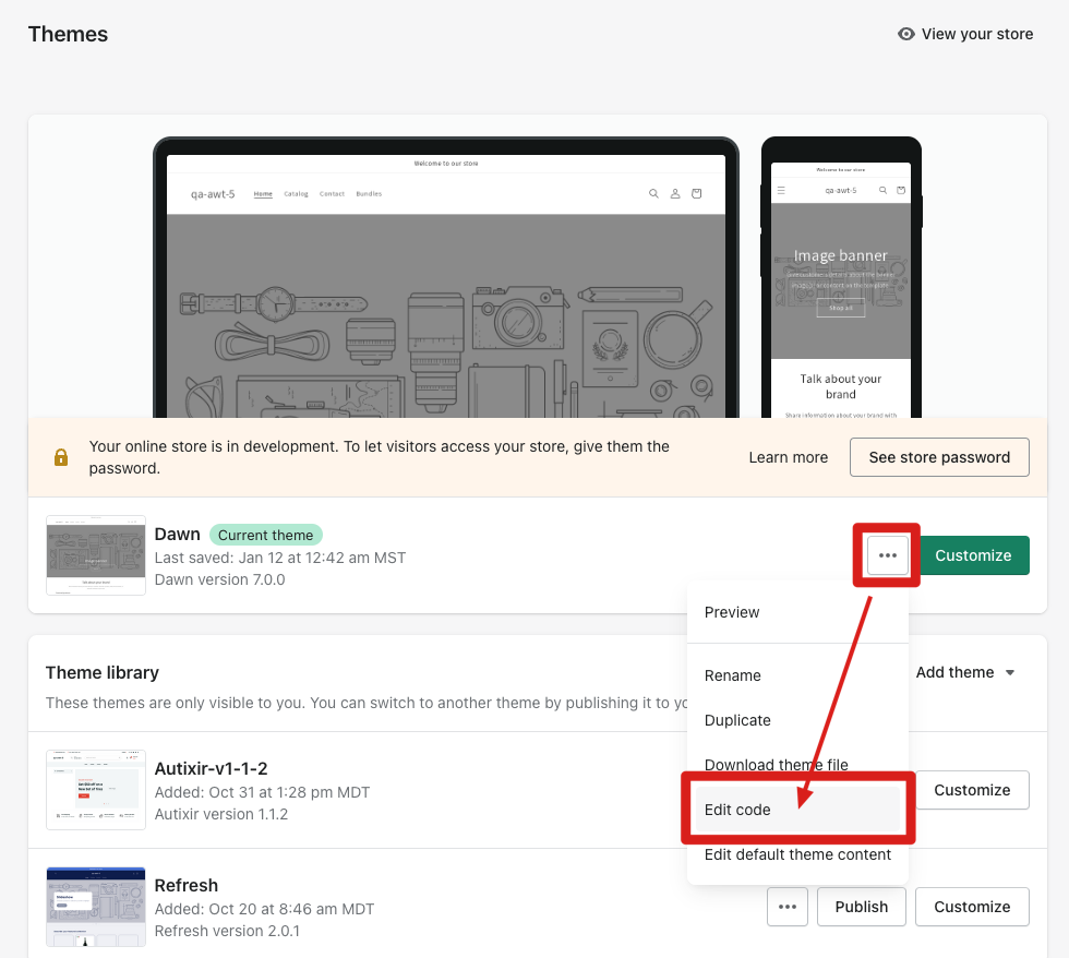
1. Open your theme code editor
To begin you'll need to open the code editor on your theme. You can find this by opening Sales Channels > Themes, click on the three dot button (aka more actions) and click "Edit Code" in the dropdown menu.
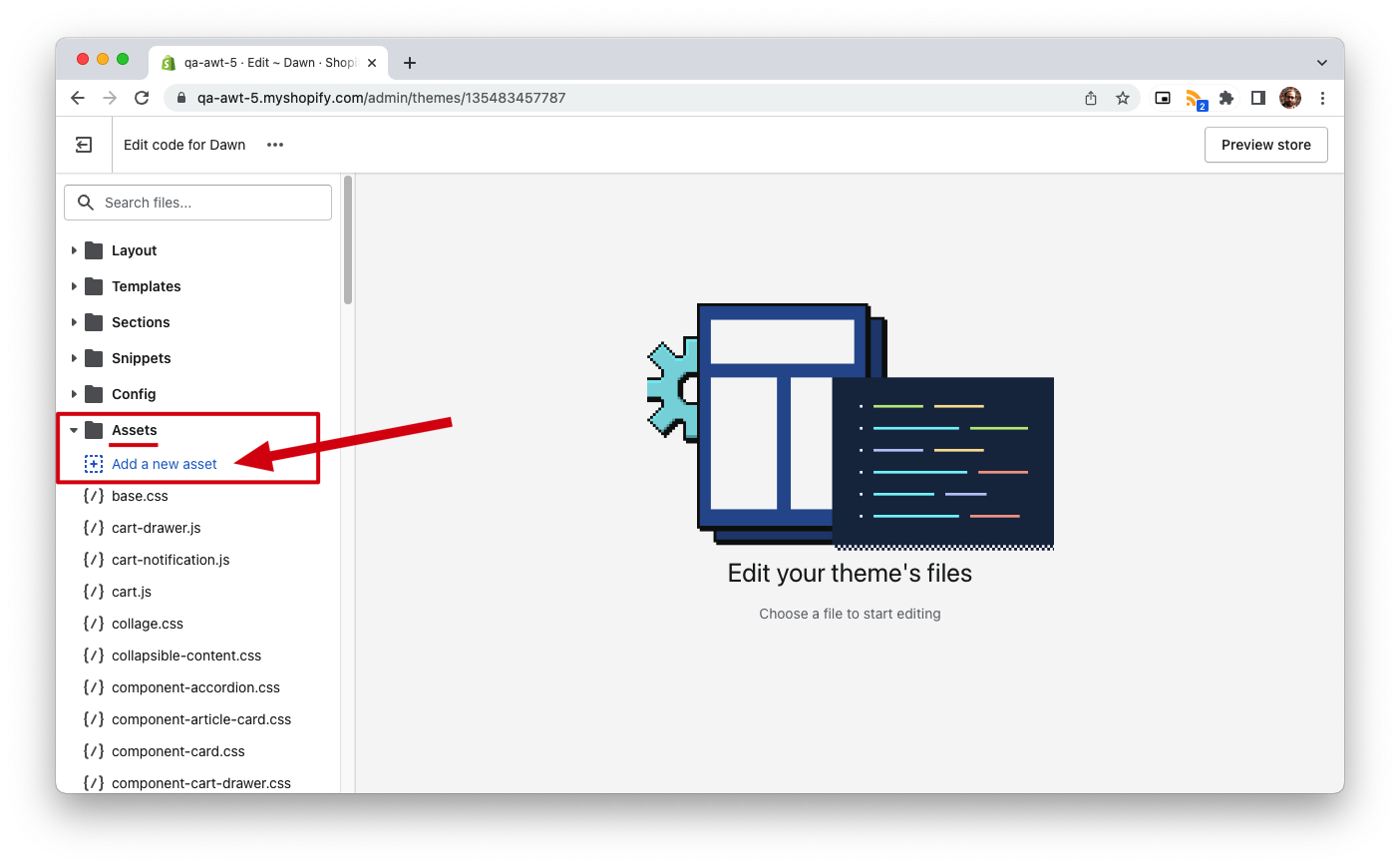
2. Create a new CSS asset
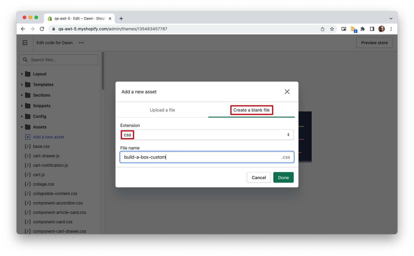
To create your own CSS file open the Assets folder, and click on Add a new asset. On the pop-up select Create a blank file, select "css" from the Extension dropdown and name it whatever you want (for example, build-a-box-custom.css).
Now copy and paste in the following CSS in your new file and click Save:
/* CUSTOM PROGRESS BAR */
@media only screen and (min-width: 750px) {

    .awtomatic-progress-item--completed button.awtomatic-progress-remove-button {
        display: inline-block;
        position: absolute;
        top: -8px;
        right: -8px;
        height: 20px;
        width: 20px;
        min-height: 0;
        border-radius: 50%;
        background-color: #fff;
        padding: 0;
        border-radius: 50%;
        box-shadow: 0px 0px 1px #000000d6;
        background-image: url(https://bundle-public-assets.s3.amazonaws.com/closeIcons/close-svgrepo-com.svg);
        background-size: 16px;
        transition: box-shadow .2s;
        background-position: center;
    }

    .awtomatic-progress-item--completed button.awtomatic-progress-remove-button:hover {
        box-shadow: 0px 0px 1px 1px #0000006e;
    }

    .awtomatic-progress-item--completed button.awtomatic-progress-remove-button:after {
        content: none;
    }


    .awtomatic-progress-count-label {
        display:none;
    }

    .bundle-container .awtomatic-progress-container {
        margin-left: auto;
        padding-bottom: 20px;
    }

    .bundleapp-modal__container--complete-screen footer { /* BaB Footer */
        height: 80px;
    }

    .bundleapp-modal__container--complete-screen .bundle-container { /* BaB content */
        padding-top: 10px;
    }

    .bundle-container .awtomatic-bab-options-container {
        order: 0;
    }
    .bundle-container .bundle-scrollable-section {
        order: 2;
        row-gap: 1rem;
    }
    .bundle-container .awtomatic-progress-container {
        order: 1;
        justify-content: center;
    }
    .bundle-container footer {
        order: 3;
    }


    .awtomatic-progress-item--completed .awtomatic-progress-product-count-container .bundle-text--subheading {
        margin-right: 10px;
    }

    .awtomatic-progress-item.awtomatic-progress-item--pending .bundle-text--subheading {
        color: #000;
    }

    .awtomatic-progress-item.awtomatic-progress-item--completed {
        background-color: #fff;
    }

    .awtomatic-progress-item .bundle-text--subheading {
        min-width: 50px;
        display: block;
        color: #fff;
    }

    .awtomatic-progress-container {
        display: block;
        text-align: center;
        max-width: 80%;
        margin: 0 auto;
    }
    div.awtomatic-progress-item {
        width: 45px;
        height: 45px;
        display: inline-block;
        background-image: url();
        background-size: cover;
        background-repeat: no-repeat;
        background-position: center;
        background-color: #eee;
        margin: 0 5px;
        border-radius: 5px;
        border: 2px solid #ddd;
    }

    /* CUSTOM PROGRESS IMAGES */
    div.awtomatic-progress-item.awtomatic-progress-item--completed {
        background-color: #eee;
        background-image: var(--awt-pb-img);
    }

}
/* END CUSTOM PROGRESS BAR */
3. Render stylesheet
Once you have the new CSS file created, you can add your custom CSS to your theme. The important part is to render this CSS from your theme, so it's actually used. To do so go to Layout folder and open a file called theme.liquid. Add following liquid code to the <head> section (if you named your CSS asset differently, make sure to replace the file name with your own):
{{ 'build-a-box-custom.css' | asset_url | stylesheet_tag }}Click Save. Now open your build-a-box page and you should see the advanced progress bar above the box items. You can adjust the CSS above in order to update colors and other styles as you prefer.
Updated 11 months ago